CSS切换-多主题切换
通用-主题】如何配置一套主题色
背景
UED 出设计稿时通常会有设计规范,通过提炼我们可以归纳为:色彩、字体、字号、边距、间距、圆角、线条。
通过调整并利用好这几组变量即可使产品风格产生很多变化。
可修改变量可参考附录《主题系统样式表》章节
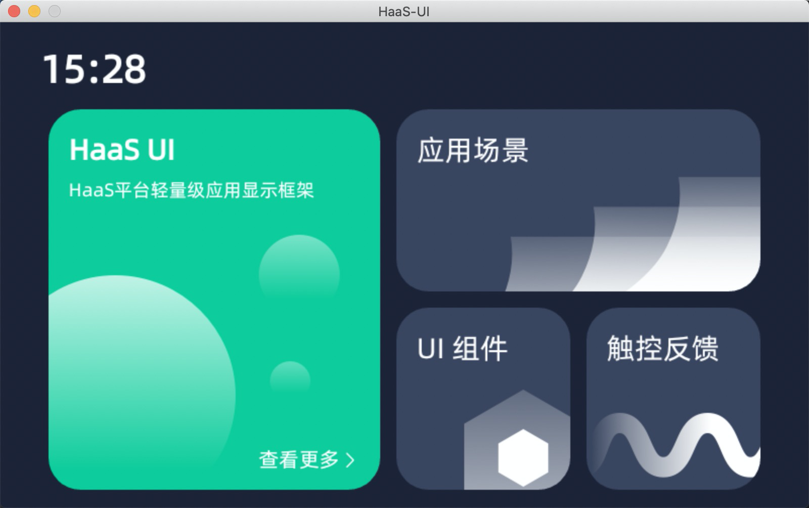
如下例我们使用 ui-demo 作为基础进行演示。
虽然通篇文章在讲主题切换(样式),但是也可以用来控制屏幕尺寸等css variable,例如:通过编译期设定 app.json 的选项 options.style.themes,控制哪个屏幕尺寸 css 被编译到小程序中。
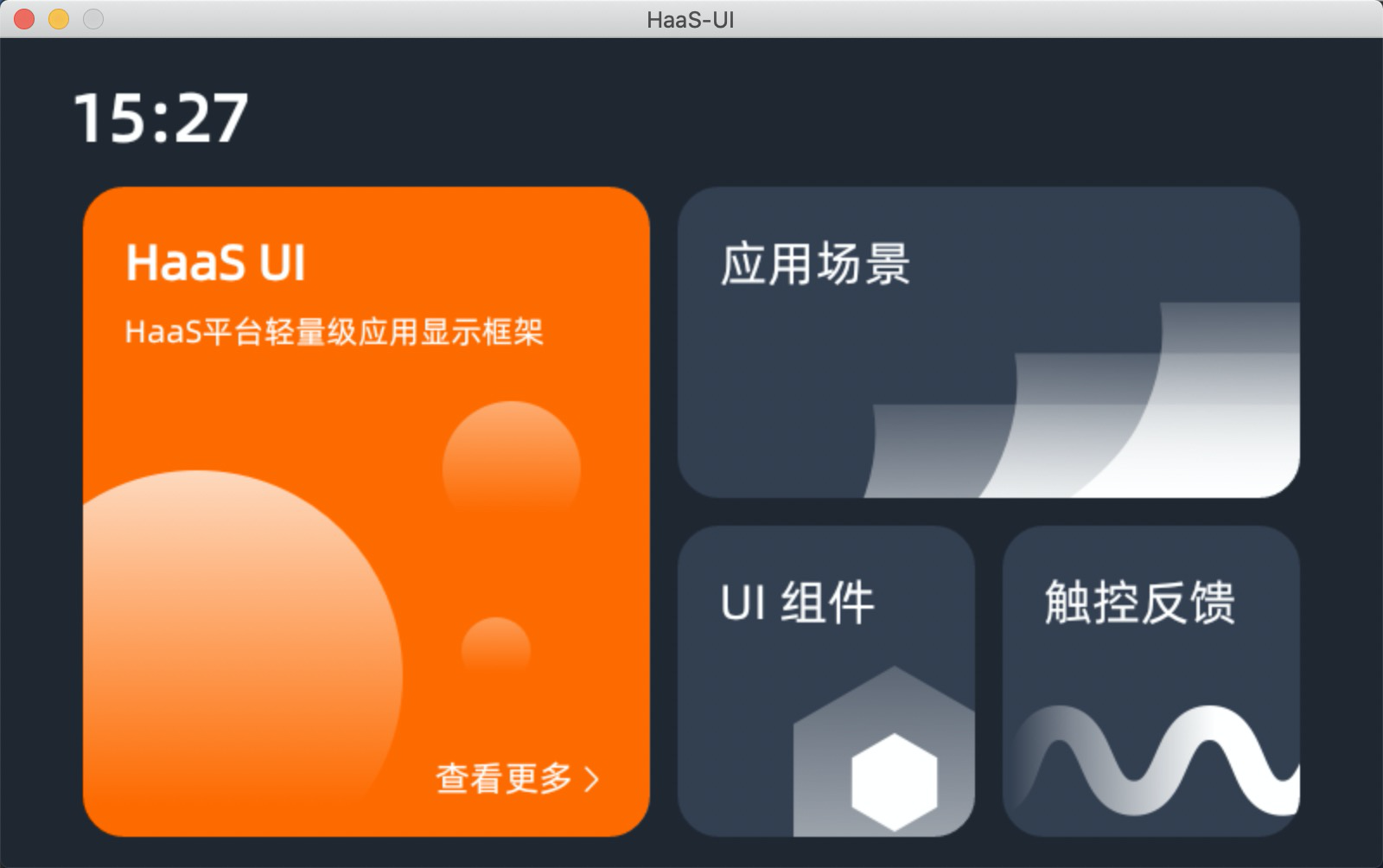
效果
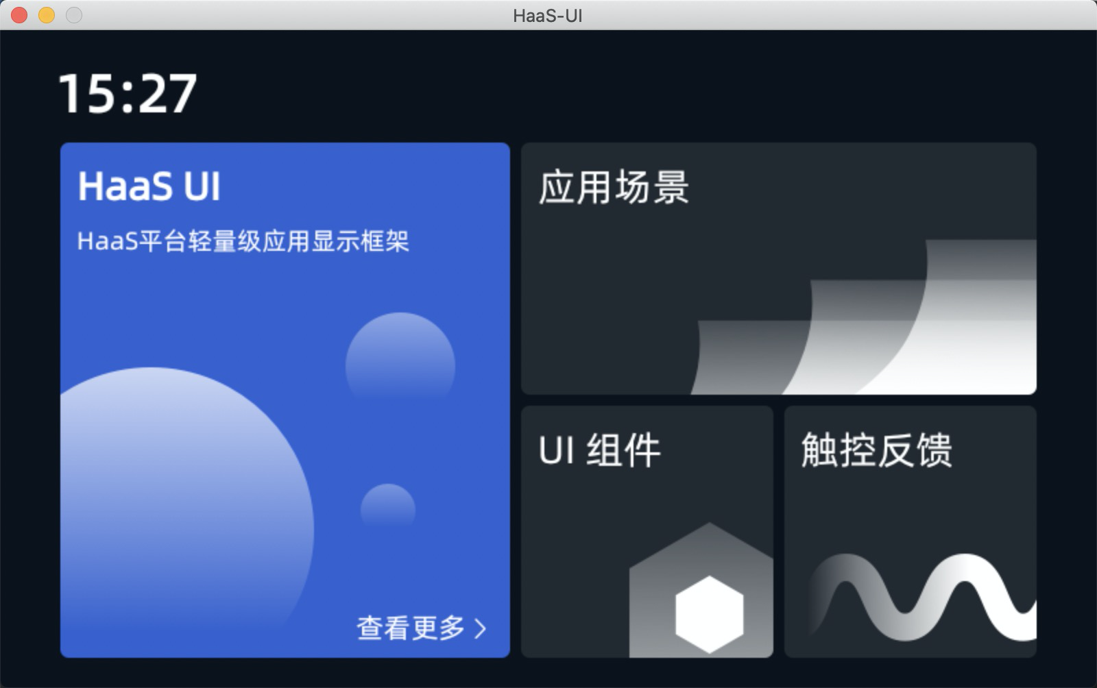
可以看到主题色、间距等已经发生变化
实现
falcon-ui 主题机制简介
由于 falcon-ui 主题机制在 app.json 中提供了指定 theme-custom 名称,并约定路径进行加载
约定的路径格式为:src/styles/<theme-custom>/
其中的组织形式与 falcon-ui 中内置的主题样式组织形式一致,以 theme-dark 为例有如下主要文件:
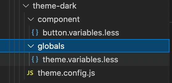
- component 中是对组件的样式定制
- globals/theme.variables.less 是全局变量覆盖
- 全局变量在 falcon-ui/src/styles/globals/theme.variables.less
- theme.config.js 是对组件的默认 props 做覆盖,比如 radio size 等
主题色定制举例
主要目标是覆盖 theme.variables.less 定义
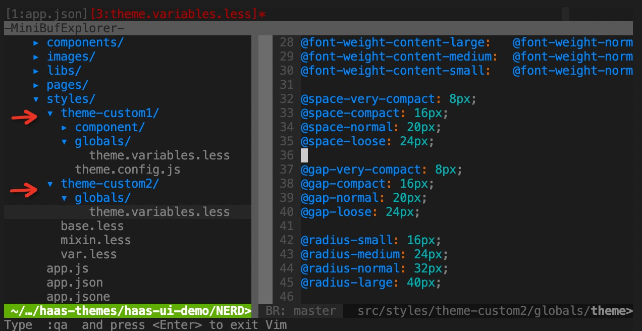
我们定义两套 theme 分别为 custom-theme1 、custom-theme2
- 主题目录结构创建
利用 falcon-ui 主题加载机制,我们创建如下目录结构,并在 app.json 中使用 customTheme 变量进行切换。
- app.json 主题切换
{
  // ...
  "options": {
    "style": {
      "themeCustom": "theme-custom2"
    }
  }
}
// 或者
{
  // ...
  "options": {
    "style": {
      "themeCustom": "theme-custom1"
    }
  }
}- 主题样式内容
styles/theme-custom1/globals/theme.variables.less
@primary: #3960CC;
@white: #FFFFFF;
@black: #000000;
@background-color: #0C121B;
@card-background-color: #232930;
@secondary: #353D48;
@btn-background-color: #4B5462;
@light-green: #7CFF00;
@green: #2D901E;
@blue: #376FDB;
@yellow: #FF9500;
@purple: #893FCD;
@cyan: #209AAD;
@red: #EF4141;

@font-size-title-large: 36px;
@font-size-title-medium: 32px;
@font-size-title-small: 28px;

@font-weight-title-large:   @font-weight-medium;
@font-weight-title-medium:  @font-weight-medium;
@font-weight-title-small:   @font-weight-medium;

@font-size-content-large: 24px;
@font-size-content-medium: 20px;
@font-size-content-small: 18px;

@font-weight-content-large:   @font-weight-normal;
@font-weight-content-medium:  @font-weight-normal;
@font-weight-content-small:   @font-weight-normal;

@space-very-compact: 4px;
@space-compact: 8px;
@space-normal: 12px;
@space-loose: 16px;

@gap-very-compact: 4px;
@gap-compact: 8px;
@gap-normal: 12px;
@gap-loose: 16px;

@radius-small: 2px;
@radius-medium: 4px;
@radius-normal: 6px;
@radius-large: 8px;

@border-small: 1px;
@border-medium: 2px;
@border-normal: 3px;
@border-large: 4px;
styles/theme-custom2/global/theme.variables.less
@primary: #0ECC9B;
@white: #FFFFFF;
@black: #000000;
@background-color: #1D2336;
@card-background-color: #3A455F;
@secondary: #4D5571;
@btn-background-color: #737F9C;
@light-green: #7CFF00;
@green: #2D901E;
@blue: #376FDB;
@yellow: #FF9500;
@purple: #893FCD;
@cyan: #209AAD;
@red: #EF4141;

@font-size-title-large: 36px;
@font-size-title-medium: 32px;
@font-size-title-small: 28px;

@font-weight-title-large:   @font-weight-medium;
@font-weight-title-medium:  @font-weight-medium;
@font-weight-title-small:   @font-weight-medium;

@font-size-content-large: 24px;
@font-size-content-medium: 20px;
@font-size-content-small: 18px;

@font-weight-content-large:   @font-weight-normal;
@font-weight-content-medium:  @font-weight-normal;
@font-weight-content-small:   @font-weight-normal;

@space-very-compact: 8px;
@space-compact: 16px;
@space-normal: 20px;
@space-loose: 24px;

@gap-very-compact: 8px;
@gap-compact: 16px;
@gap-normal: 20px;
@gap-loose: 24px;

@radius-small: 16px;
@radius-medium: 24px;
@radius-normal: 32px;
@radius-large: 40px;

@border-small: 1px;
@border-medium: 2px;
@border-normal: 3px;
@border-large: 4px;
效果
可以看到主题色、间距等已经发生变化
原主题
主题1
主题2
主题变量设计&应用原理
如下列出主题变量中应用的场景,可以灵活使用。
色彩
- 主题色,比如 primary button 即主题色;
- 背景色,比如页面背景色;
- 卡片背景色,顾名思义,卡片元素的背景色,视觉上会与背景色区分;
- 辅助色,一些组件设计时主色相对的辅助色, 比如按钮有“确定”“取消”,其“确定”一般为主色,另外为辅助色;
- 按钮色,按钮默认(default)时的颜色;
- 功能色_*,其他色相,配合使用颜色成体系。
字体、字号、字重
- 标题:大中小标题
- 正文:正文、二级正文、辅助文
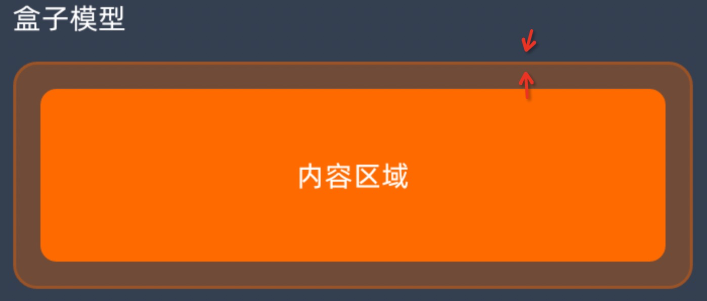
边距
- 通常为 padding,即内容到容器边的距离

- 通常为 padding,即内容到容器边的距离
间距
- 通常为 margin,即两个元素之间的距离
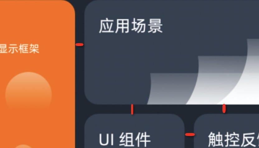
- 通常为 margin,即两个元素之间的距离
圆角
- 通常为 border-radius,即容器的边角圆弧
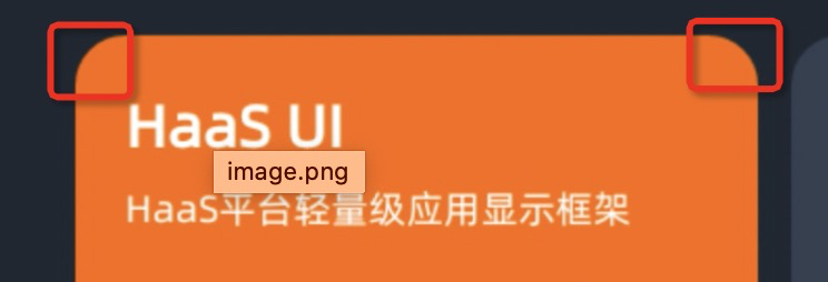
- 通常为 border-radius,即容器的边角圆弧
线条
- 通常为 border-width,即容器边的粗细
- 通常为 border-width,即容器边的粗细
【通用-主题】theme切换系统机制
编译配置
在 app.json 中配置theme后,通过 cli 编译主题样式
+++ b/src/app.json
@@ -26,7 +26,7 @@
   },
   "options": {
     "style": {
+        "themes": ["theme-dark", "theme-custom1", "theme-custom2"]
     }
   }
 }
系统全局配置
+++ b/resources/env.json
+{"theme":"theme-custom2"}
系统动态改变
+ methods: {
+ onChangeTheme() {
+ const themes = ["theme-dark", "theme-custom1", "theme-custom2"]
+ this.index = this.index || 0
+ this.index = this.index++ % themes.length
+ const theme = themes[this.index]
+ $falcon.env.custom.$set('theme', theme)
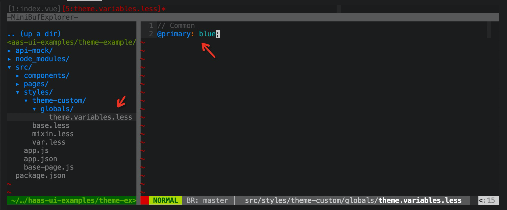
+ }【通用-主题】如何修改主题色
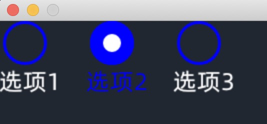
需求
radio button 默认的橘色不适合,需要改为蓝色。
实现方法:通过修改less变量的主题色 @primary 来实现。
实现
- 在 src/styles/theme-custom/globals/theme.variables.less 中声明 less 变量
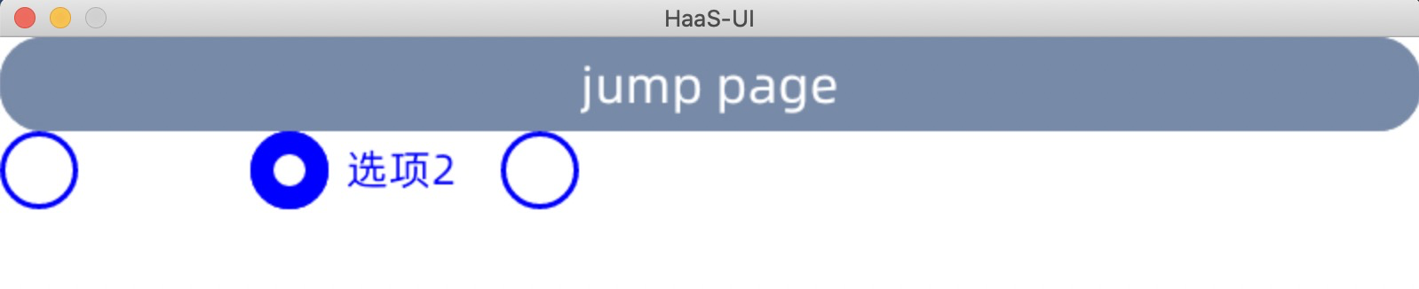
效果
原理
在 globals/theme.variables.less 中定义的这些变量会在 falcon-ui 编译过程中注入,并覆盖原有声明变量。
所有可修改变量可以在 node_modules/falcon-ui/src/styles/globals/theme.variables.less 中查看
建议可修改变量可参考附录《主题系统样式表》章节
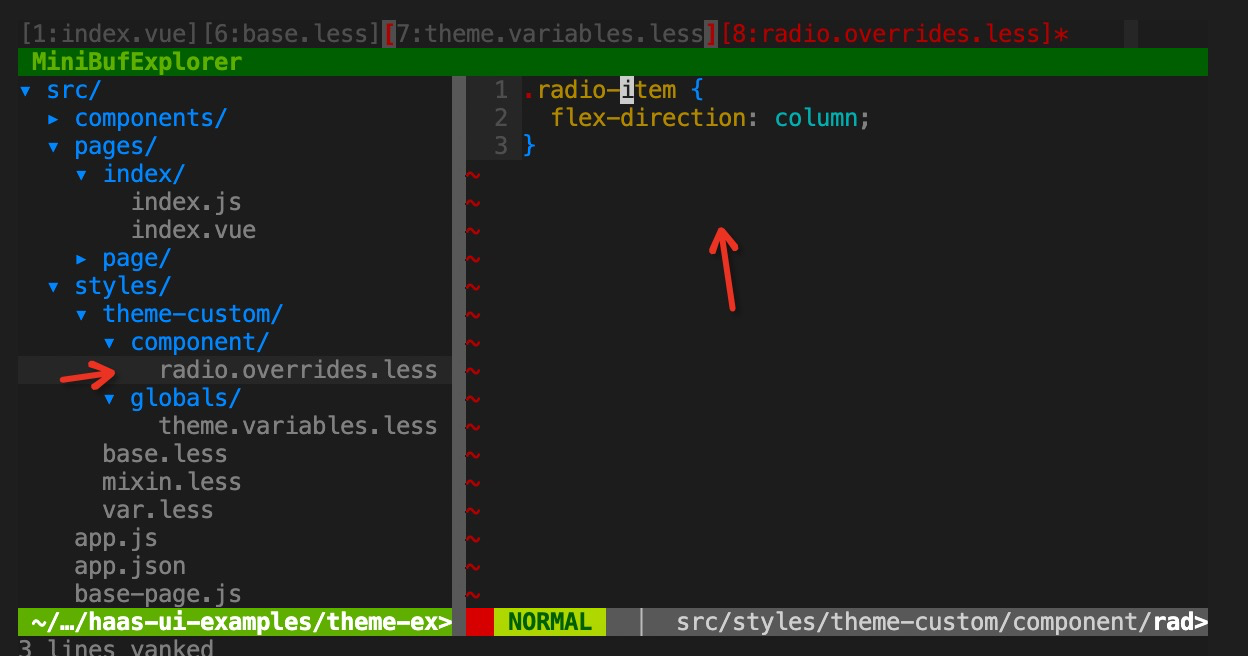
【通用-主题】如何修改控件样式
背景
想要对某一个控件样式做全局调整,比如想要 radio button 的 label 成竖向排列。
实现
- 创建文件 src/styles/component/radio.overrides.less,并添加样式
.radio-item {
  flex-direction: column;
}
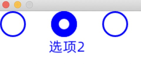
效果
原理
falcon-ui 主题框架中,对每个组件设计留有覆盖机制,因此 componet/xxx.overrides.less 会被作为 css style 覆盖到控件 <style></style> 内部最下方,因此会将上方声明的相关样式做覆盖操作。
【通用-主题】如何利用内置主题变量
背景
falcon-ui 控件库主题十分统一,而封装custom 控件时如果理解并统一使用主题变量,后续风格调整会一起变化。
关于主题变量,建议使用几组全局控制开关,包括色彩、字体、字号、边距、间距、圆角、线条。
可参考附录《主题系统样式表》章节
实现
- 在 src/styles/base.less 中添加 falcon-ui 主题色变量引用
@import "falcon-ui/src/styles/theme.less";- 在 index.vue 需要使用的页面引用 base.less
<style lang="less" scoped>
@import "base.less";
// ...
</style>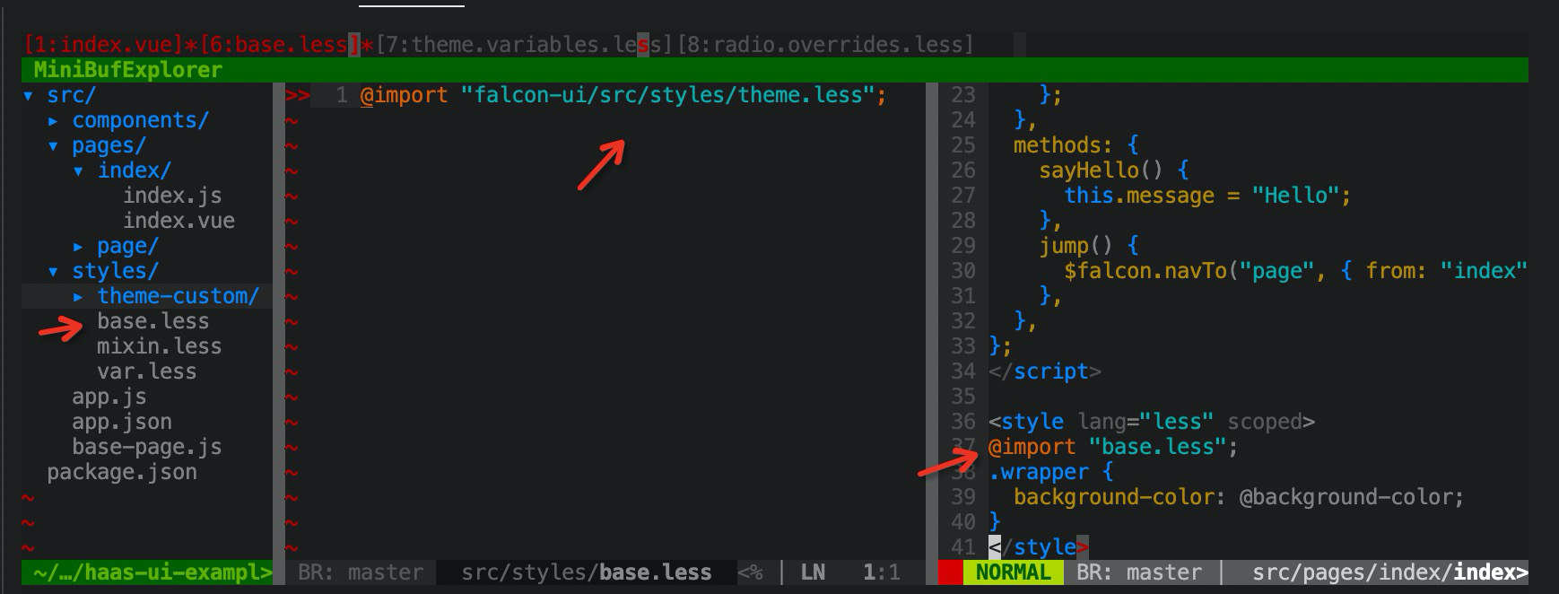
- 在 css style 中使用样式变量,比如 @background-color
<template>
  <div class="wrapper">
    <fl-radio :items="radioItems" v-model="radioValue" />
  </div>
</template>
<style lang="less" scoped>
.wrapper {
  background-color: @background-color;
}
</style>
效果
附录:主题系统样式表
样式架构
- 色彩
- 字体
- 字号
- 边距
- 间距
- 圆角
- 线条
色彩
| 主题色 | #FF6A00 | @primary | |
| 白色 | #FFFFFF | @white | |
| 黑色 | #000000 | @black | |
| 背景色 | #202731 | @background-color | |
| 卡片背景色 | #343F50 | @card-background-color | |
| 辅助色 | #48586F | @secondary | |
| 按钮色 | #778AA7 | @btn-background-color | |
| 功能色_荧光 | #7CFF00 | @light-green | |
| 功能色_绿 | #2D901E | @green | |
| 功能色_蓝 | #376FDB | @blue | |
| 功能色_黄 | #FF9500 | @yellow | |
| 功能色_紫 | #893FCD | @purple | |
| 功能色_青 | #209AAD | @cyan | |
| 功能色_红 | #EF4141 | @red |
状态色彩:
通过不透明度区分组件的状态(此配置不建议在可配置样式表中)
正常 - 100%
点击 - 60%
禁用 - 40%
字体
| 默认(中,英文,数字,符号) | 阿里巴巴普惠体 |
|---|---|
| 特殊数字 | Alibaba Sans 102 |
字号/字重(基于4寸屏)
| 标题 | 大标题 | 36 | Medium | @font-size-title-large@font-weight-title-large |
|---|---|---|---|---|
| 中标题 | 32 | Medium | @font-size-title-medium [normal?]@font-weight-title-medium [normal?] | |
| 小标题 | 28 | Medium | @font-size-title-small@font-weight-title-small | |
| 正文 | 正文 | 24 | Regular | @font-size-content-large@font-weight-content-large |
| 二级正文 | 20 | Regular | @font-size-content-medium [normal?]@font-weight-content-medium | |
| 辅助文 | 18 | Regular | @font-size-content-small@font-weight-content-small |
边距(基于4寸屏)
| 极紧 | 8px | @space-very-compact |
|---|---|---|
| 紧凑 | 16px | @space-compact |
| 标准 | 24px | @space-normal |
| 宽松 | 32px | @space-loose |
间距(基于4寸屏)
| 极紧 | 8px | @gap-very-compact |
|---|---|---|
| 紧凑 | 16px | @gap-compact |
| 标准 | 24px | @gap-normal |
| 宽松 | 32px | @gap-loose |
圆角(基于4寸屏)
| 小 | 8PX | @radius-small |
|---|---|---|
| 中 | 16PX | @radius-medium |
| 标准 | 24PX | @radius-normal |
| 大 | 32PX | @radius-large |
边框
| 小 | 1PX | @border-small |
|---|---|---|
| 中 | 2PX | @border-medium |
| 标准 | 3PX | @border-normal |
| 大 | 4PX | @border-large |